I blog because I’m a writer, not because I have a desire to present lovely images to my readers. When I reluctantly began adding images to my blog posts, my designs were all over the place. What I included depended on what images I could find and my mood that day.
When blogging friends told me they were getting a lot of traffic from Pinterest, I decided to create vertical images for my blog posts. I did that for a while, but those images never showed up well on Facebook or Twitter. How was I supposed to decide what size and orientation I should use for my images?
The first time someone told me she created multiple images for each blog post, I thought it sounded like a lot of work—but I also realized that it might be the solution to my image dilemma.
For a little over a year now, I have created two images for each blog post I write.
Why Two Images?
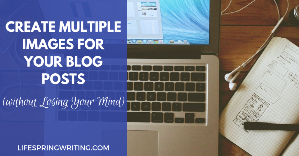
 The image at the top of my blog post is horizontal (image 1). It captures my readers’ attention without them having to scroll down to see the whole image or find where the text begins. This image serves as the featured image and works well on Facebook and Twitter.
At the bottom of the post I have a vertical image (image 2) that can be pinned to Pinterest. I put it at the bottom so it doesn’t interfere with anyone’s reading experience, yet it is handy for anyone who wants to pin it.
By creating two images with each post, I make it easy for my readers to share my posts in a way that looks clean and appealing.
Creating Two Images
I create both images at the same time using an online photo editing program, either working in two separate browser tabs simultaneously or using a program that automatically resizes for me.
The specific image dimensions are based on guidelines from Facebook and Pinterest. At the moment, Facebook recommends 1,200 x 630 pixels and Pinterest recommends 600 x 900 pixels.
Image Editing Programs
I’ve used Canva, PicMonkey, LunaPic, and Pablo.
Canva has both free and paid versions. The paid version offers robust branding features (including colors, fonts, and logos), unlimited storage of images you’ve created, and automatic resizing of images to work with different platforms. The free version allows up to three brand colors and provides limited image storage. You still have access to many templates, fonts, and design elements. For most bloggers, the free version offers enough flexibility to get by just fine.
PicMonkey has two paid options. (They discontinued their free level in 2017.) PicMonkey is an excellent option if you like creating your own designs from scratch. The higher tier version offers more image storage capacity and more image formats. One nice feature with PicMonkey is that when you upload an image, you can use an eye dropper tool to identify the code for any color in the image so you can use the color in other ways in the image. PicMonkey has good tutorials on how to make double exposure or turn a photo into an illustration.
LunaPic is free and offers unique effects that I haven’t seen elsewhere without paying, including animation. (See this post for an example.) It isn’t as intuitive to use, but I often find myself there if I want to do something fun with an image I’ve created elsewhere.
Pablo is free and very simple to use. It offers a resizing option and allows you to use your own images and logo. It doesn’t have much flexibility. For instance, unlike the other programs I’ve mentioned, you are more limited in text colors and cannot create an image that consists only of words. If you are looking for something very quick and simple, though, it might be a very good option for you.
I’ve used PicMonkey and the free version of Canva for most of my blog post images. These don’t offer options for automatic resizing, so I work with two browser tabs open at one time, creating the Facebook image in one tab and the Pinterest image in the other.
Design Elements
Whether I am working in a program that resizes or am working in two browser tabs at once, I use the same design elements for both images I am creating.
Picture
I use the same photo or illustration in both the horizontal and vertical image in each post. Some people create several different vertical images to appeal to more people on Pinterest, but that just isn’t something I want to take time to do. I like my images to match–although different styles of images certainly would appeal to a wider variety of potential readers.
Color
I have three colors that are part of my brand. I have a file where I’ve listed the hex codes for these colors. I often use them in my images.
If I am using a photo in my image, I often pull a color directly from the photo. The Chrome browser has an Eye Dropper extension that allows you to grab the code for any color on a page. If you use PicMonkey, you can use the eye dropper tool within the program. Pablo will generate color options pulled from the image you are using. If I want to use more than one color in my image, I will paste the code into a color palette generator to determine other colors that will work well.
Text
The words are the same on both images. I provide both the title of the blog post and my blog URL. I used to include a question or teaser quote as well. It’s a good idea because it invites readers to click on the pin to learn more, but I decided to give that up in favor of simplicity.
Font
Many experts will tell you to use only two fonts in your images. I don’t follow that so well. I alternate between three different fonts for the blog title. The URL always appears in a different font that never varies.
Template
I have several different templates I use for the horizontal image and several for the vertical image. Some photos simply do better in some templates than in others. Having limited options to choose from prevents decision paralysis while providing the flexibility that I need depending on the photo I use.
Putting It All Together
With two browser tabs open in the image editing program I’m using, I decide on my templates and then put all these elements together, moving back and forth between both tabs. I input the same color code for the background in both images, paste the title in, select the font, add the photo or other design elements (such as shapes or lines), and that’s it.
At first it seems a lot to pay attention to, but after a few times, it’s easy to see that producing two images at once really isn’t much more work than producing one. I could easily add a third browser tab to design a square image for Instagram, too.
With two images for each post, I can easily share my posts on social media and know that they will look good.
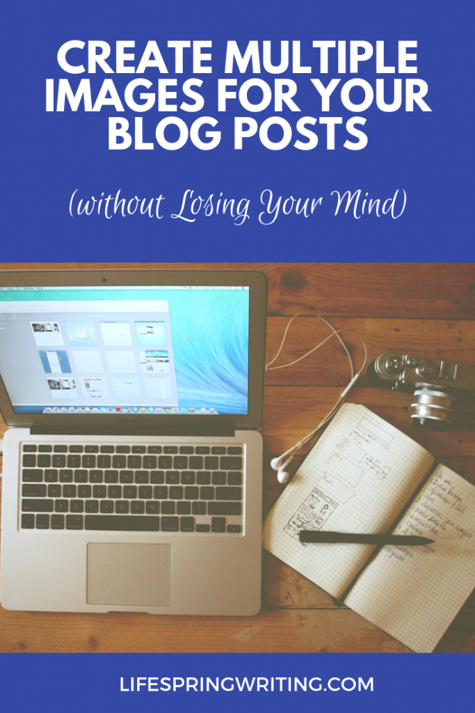
Image credit | Free-Photos at pixabay.com